Re-imagining the merchant onboarding experience as a white-label
Youtap Technology
Timeframe
Mar '24 - Jun '24
My responsibilities
Overview
Youtap's original merchant application, under the name "YouPay" was severely outdated, didn't have the required features for many businesses, and even had accessibility issues.
With a growing client base Youtap's merchant application was in need of a re-design.
Goal
The unique selling point of white-label is it's customisation, but this leaves us unable to control what a user may experience when business needs and requirements come into play.
Our goal is to balance the vast feature set a white-label can offer, without compromising on user experience.

Introduction
What is a white-label product?
Youtap provides a blank canvas app, or white-label products, that can be configured and rebranded to a client's own branding identity to create a unique product under their own name. You'll never see a Youtap app on the market, but you might recognise the layout.
Why did we start this?
Before Youtap Merchant, there was YouPay. The YouPay merchant application was designed before my time, and thus there were very few resources on the actual base app. After gaining interest from a major client, the plan was to re-design and cater towards a wider audience.
Kickoff
Identifying our potential clients, prioritising their complex needs and preferences
We initiated the start of the project by diving into who our clients may be as a white-label product and what we could offer them. We chose to focus on potential clients in different sectors and their complexity.

Traditional
banks
Requires secure and reliable customer verification process, with integration into their own existing systems to follow their own business standards.

Fintech
startups
To meet a range of business needs for different companies, a range of features would be best for the company to select by preference and standard.

E-commerce
platforms
To cater to a diverse range of customers, onboarding requires flexible customisation and a easy account setup that will allow users to get started quickly.
An audit and user testing revealed issues with UI and the journey
We also conducted a user experience audit and a user test on 5 users on the current state of the application, which helped me to establish the key problems attempting to onboard and the feature gaps.

Next was to breakdown the key issues that needed to be addressed going forward, both from a user and a business perspective
Onboarding process offered limited features, even with the full journey, failing to offer the unique selling point of a white label app.
Merchant onboarding, KYB and KYC have been combined, but lack proper differentiation, causing the full journey to be overwhelming for users.
HMW
How might we balance a streamlined onboarding process, while maintaining a large range of customisation for white-label clients?
Prioritisation
Organising insights and data from our research
Utilising an affinity map allowed us analyse our synthesise our findings.
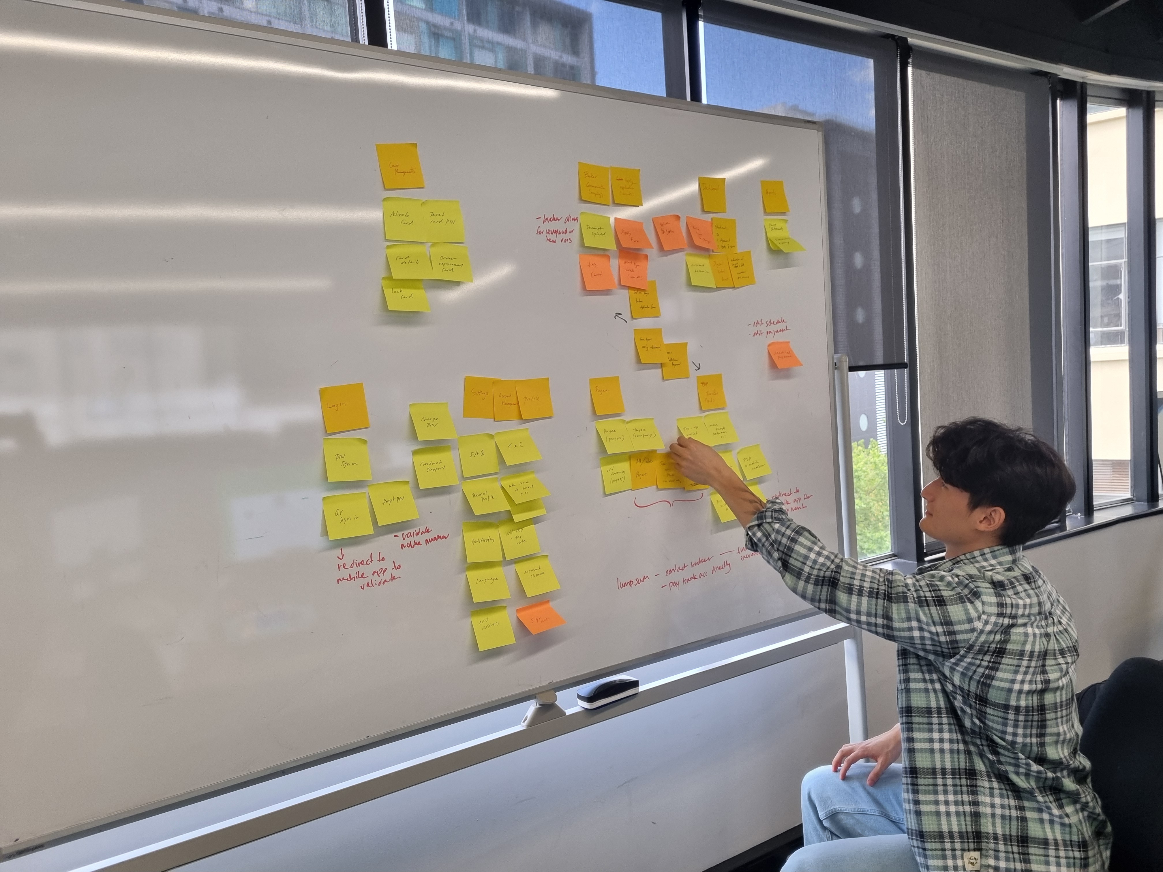
Prioritising the essentials to meet product delivery
Given the limited resources and the timeframe for this MVP, the full extensive feature list would be overwhelming to tackle. Instead of focusing on the full picture my best bet was narrowing down the list to core functions to prioritise over optional add-ons, so that we could deliver.

Design process
Designing from sketches to MVP was made easier with an established component library
Fast iteration happened during our sketching stage, which allowed us to make changes with ease before anchoring down on the digital design.

Due to already having an established component library, and the importance of consistency throughout our products, we used out design system to develop the final designs. This allowed us to use our assets in a puzzle-building way quickly, resulting in an easier transition to the MVP.

Testing the base product with user results
We used an unmoderated method of testing to discover the following goals:
Is the journey well structured and efficient?
Are users able to understand the onboarding tasks well?
Further testing would need to be conducted following client specific customisations.

The tasks are easy to understand, the categories help with user expectations.

While the process is still long, breaking it up into steps and providing progression marks helps provides clarity.
The solution
Balancing simplistic, streamlined journeys for users and a large range of customisation options for clients
Overall our solution aimed to reduce stress on the users by breaking down the onboarding journey into more manageable steps, while also maintaining a priority for expanding our feature set to meet diverse business requirements.
For our users -
A separated step-by-step process for onboarding, KYC and KYB
While we can't control the length of the process in a white-label, we can control what users see.
Simplistic and straightforward forms
The simplistic design ensured users wouldn't be overwhelmed with the amount of information needed onboard on one page.

For our clients -

Easy rebranding for any client
Designs that will support any branding choice, whether it be text, colour or content.


16+ customisable features for onboarding customers
Endless combinations for security, verification and store account to support any business requirements or standards.
Reflections
Notes for the future
Keeping the scope minimal to meet delivery expectations
The challenge of balancing feature sets with user experience, within the context of a white-label, required us to rethink and refine our approach. I learned first hand the importance of focusing on the essential product value and avoiding feature creep. Although this is just the beginning, we have set a solid foundation for the future of the Merchant app.